
Outdoor lighting does more than extend usable hours in the yard, it shapes how spaces feel, function, and look after dark. Yet many homeowners treat color temperature as an afterthought, picking bulbs based on what’s in stock at the big-box store. The truth is, color temperature, measured in Kelvin (K), is the difference between a backyard that feels cozy and one that feels like a parking lot. Whether installing path lights, uplighting, or overhead fixtures, understanding how warm and cool tones affect visibility, mood, and your home’s nighttime appeal is essential. This guide breaks down color temperature fundamentals and shows you exactly which temperatures work best for different outdoor zones.
Table of Contents
ToggleKey Takeaways
- Color temperature measured in Kelvin (K) fundamentally changes how outdoor spaces feel—warm tones (2700K–3000K) create cozy, relaxing atmospheres while cool tones (4000K–5000K) enhance safety and visibility.
- Cooler color temperatures improve contrast and make hazards easier to spot, making them ideal for driveways, pathways, and security lighting around entry points.
- Warm light for outdoor lighting works best on patios and entertaining areas where it flatters skin tones and encourages relaxation, though you may need slightly higher lumens to achieve the same perceived brightness.
- Consistency matters: keep adjacent fixtures within 1000K of each other to avoid a disjointed appearance, with warm zones paired with entertaining spaces and cool zones reserved for task-oriented areas.
- Test your color temperature choices by installing a few bulbs and observing them at different times and brightness levels before fully committing, since personal preference varies by home style and individual perception.
Understanding Color Temperature Basics
Color temperature describes the warmth or coolness of light, measured in Kelvin. A lower Kelvin value (2000K–3000K) produces warm, orange-tinted light reminiscent of incandescent bulbs. Higher values (4000K–6500K and beyond) lean blue and white, mimicking daylight or overcast skies.
The human eye perceives these differences instantly. A 2700K bulb feels intimate and relaxing, think candlelight or a classic porch light. A 5000K bulb is neutral and energizing, similar to midday sun. Most people don’t consciously notice the shift, but their brains register comfort or alertness based on the light’s tone.
Outdoor fixtures now come in a wider range of color temperatures than ever before, especially with LED technology. You’re no longer locked into the warm-only or daylight-only camps. Smart bulbs even let you adjust color temperature on the fly, though that’s beyond basic installation. For most DIYers, the key is choosing the right baseline temperature for each area and sticking with it for consistency.
Why Color Temperature Matters For Outdoor Spaces
Impact On Safety And Visibility
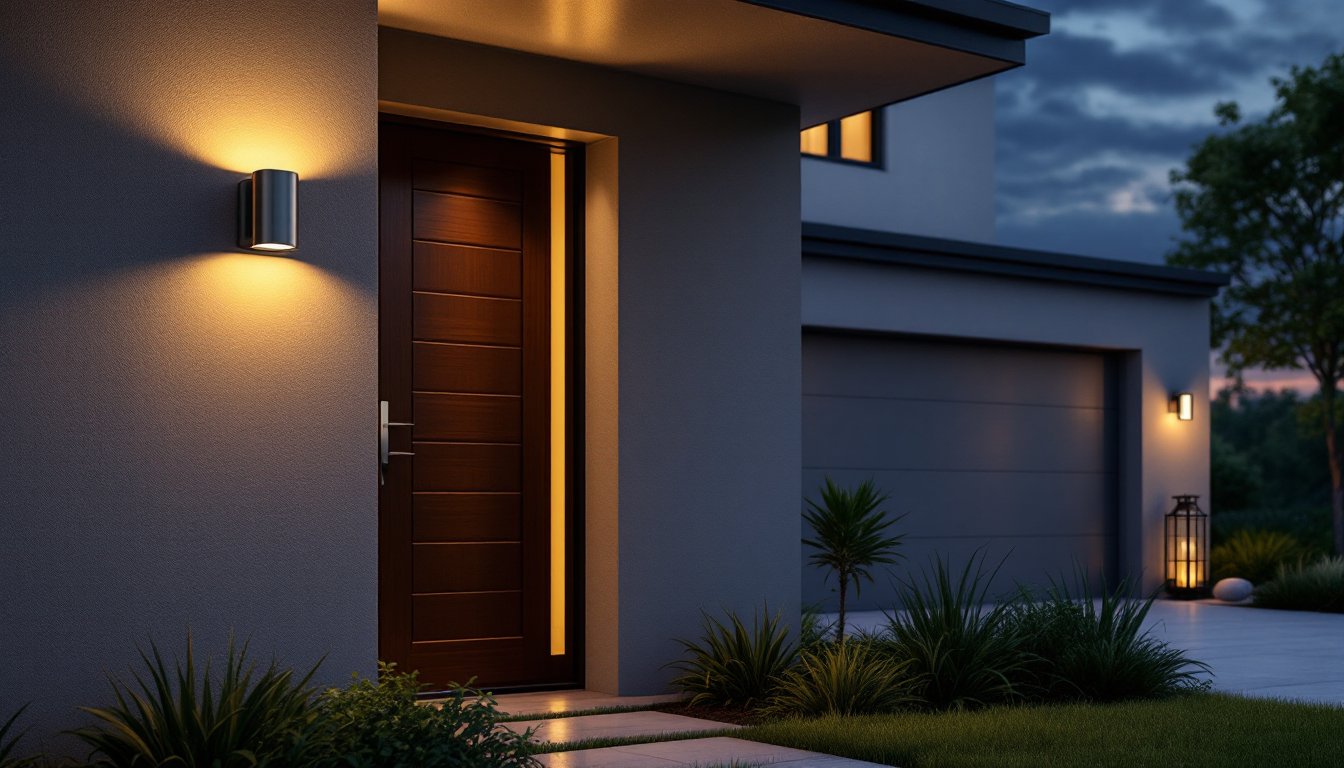
Colder color temperatures (4000K–5000K) enhance contrast and visibility, making hazards, uneven steps, garden edges, driveway cracks, easier to spot. This matters most in high-traffic zones like entries, driveways, and pathways. Security lighting around doors and perimeter fixtures also benefits from cooler tones: the clear, sharp light makes it harder for unwanted visitors to hide and easier for cameras to capture detail.
Warm light (2700K–3000K) is safer than it gets credit for, though. It doesn’t reduce visibility as much as people fear: it simply feels less harsh. The trade-off is that it can make fine details, like reading a house number from the street, trickier. Many homeowners find a middle ground works best: 3000K fixtures on entries and driveways, with warmer 2700K for accent and entertaining spaces nearby.
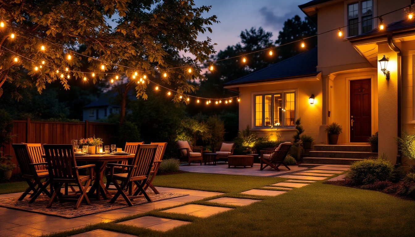
Creating Mood And Atmosphere
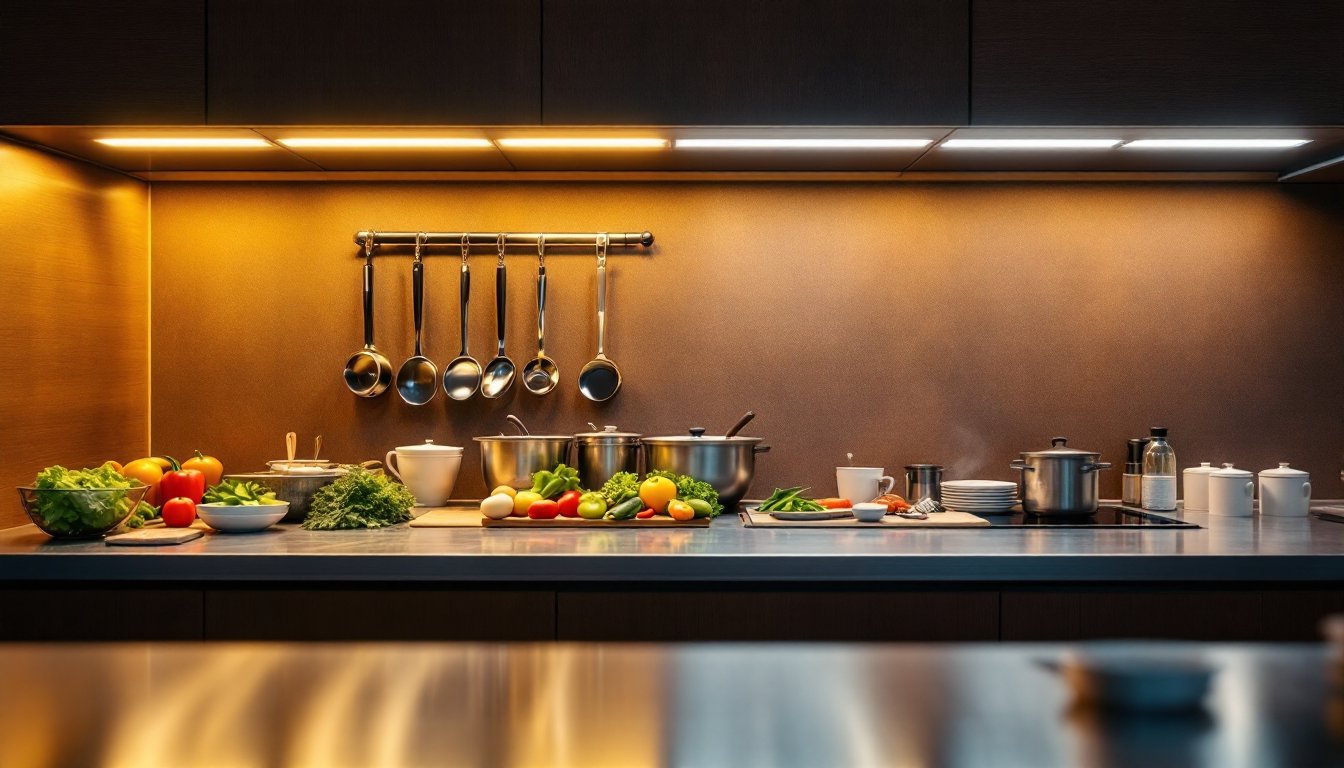
Warm light invites relaxation and conversation. A patio lit at 2700K feels like an extension of your living room, encouraging people to linger over drinks and dinner. Cool light, conversely, energizes and clarifies. It’s clinical, which is why kitchens and workspaces gravitate toward it.
Mixing temperatures in a single yard can feel disjointed if you’re not intentional. A common mistake is putting a warm-toned patio light next to a cool-toned driveway fixture, the contrast reads as sloppy rather than thoughtful. Decide on a primary temperature for your entertaining zone (usually warm) and keep secondary functional areas within one step of that, so 2700K paired with 3000K, not 2700K paired with 5000K. Color consistency across your outdoor space matters more than people realize, and it’s one of the easiest fixes for a yard that feels “off.”
Choosing The Right Color Temperature For Your Outdoor Area
Warm Light For Entertaining And Relaxation
Patios, decks, pergolas, and seating areas are prime candidates for warm color temperatures. A 2700K or 3000K fixture paired with dimmable controls lets you set mood on demand, full brightness for evening games or cooking, dimmed for cocktails and conversation. Warm light also flatters skin tones and makes food look appetizing, which matters if you’re eating outdoors.
String lights, bistro lights, and decorative lanterns almost always come in warm temperatures, so they’re your ally here. When choosing bulbs for existing fixtures in these zones, look for warm white LED bulbs rated 2700K. Make sure they’re labeled as outdoor-rated to handle temperature swings and moisture, indoor bulbs won’t last long in the elements.
One practical note: warm light is directional in perception. A 30-watt equivalent LED at 2700K might feel dimmer than the same wattage at 5000K, even though the lumens are identical. If you’re converting from old incandescent fixtures, you might need to bump up lumen output by 10–20% to achieve the same perceived brightness. Check the lumen rating on the package, not just the wattage equivalent.
Cool Light For Task-Oriented Spaces
Driveways, entry paths, garage aprons, and any area where safety and visibility are primary goals benefit from 4000K–5000K light. These color temperatures sharpen details and improve contrast, handy when you’re unlocking a door in the dark or looking for a package on the porch.
If you’re installing new fixtures in these zones, floodlights and uplights rated 5000K (daylight) are the standard choice. They’re widely available in LED form and cost almost the same as warm alternatives. For security lighting, especially around entry doors or back gates, many pros lean toward 5000K because it pairs well with security cameras and feels less inviting to lurkers.
Balancing function and comfort matters. A driveway bathed in harsh 6500K (cool daylight) light might feel like an interrogation room. Dial it back to 4000K (cool white) for a touch more warmth while keeping visibility sharp. This middle-ground temperature works surprisingly well as a transition zone between warm entertaining spaces and cooler security-focused areas. If your home’s exterior lighting is visible from multiple angles, say, warm patio lights visible from the driveway, keeping adjacent fixtures within 1000K of each other prevents the jarring shift that reads as a lighting design afterthought.
<h2 id="” data-id=””>Putting It All Together: A Practical Game Plan
Start by mapping your yard and assigning zones: entertaining (warm), functional (cool), and transition (middle-ground). Sketch where fixtures are or will go, and note what you’re using each space for most. A patio used 80% for dining? Go warm. An entry path that’s your first impression at night? Go cool.
Before buying bulbs, verify your fixtures are outdoor-rated and check whether they’re dimmable. Smart bulbs aren’t necessary, but they’re increasingly affordable for recessed and pendant fixtures. If you’re keeping it simple, standard dimmable LED bulbs give you plenty of control without the app.
Last: buy a few test bulbs in your preferred temperature, install them, and live with them for a week. See how they look at dusk, in full night, and at different brightness levels. Color temperature is personal: what feels perfect for your neighbor’s modern ranch might feel cold in your traditional Victorian. Trust your eyes, not a product description. Once you’ve settled on your palette, stick with it. Consistency makes even modest lighting feel intentional and polished.